 Jamil Mahmud
NXFX: designing a forex trading app for beginners and day traders
 NXFX cover. Source: Behance
| Product | My role | Tools | Outcome |
|---|---|---|---|
| NXFX, mobile trading app (iOS, Android) | Product manager and UX/UI designer, solo | Forex desk study · Personas · IA · Hi-fi screens | Design concept, published on Behance |
NXFX is a mobile trading app I designed in 2022 for iOS and Android. Trading apps carry money, risk and regulation in every screen, which makes them a hard test of product thinking. It is a concept, not a shipped product. No client is named in the credits and there is no live app behind it. What it shows is how I break down an unfamiliar domain before designing anything.
Learning the domain first
Before drawing a screen, I wrote a forex study and published it three days before NXFX. It covers the basics a trader takes for granted: currency pairs, bid and ask, spreads, pips, lot sizes, leverage and margin. It also covers the three ways traders read a market (fundamental, technical and sentiment analysis), the chart types they use, and the order types they place.
I also scanned the field. I looked at MetaTrader 4 and 5, cTrader and TradingView as platforms, and at brokers such as eToro, Pepperstone, IG, OANDA and Plus500. Each had a clear angle: copy trading, MetaTrader support, beginner friendliness, charting. That scan showed what the strong players already did well, and where a simpler app could stand out.
The problem
I framed six problems from that study:
- New traders do not know where to start.
- Most apps in the stores are too complicated.
- Traders want buy and sell signals at the right time.
- Users want to connect a brokerage account without friction.
- Chart analysis should make forecasting easier, not harder.
- Traders need to know what the market is doing at all times.
The goal followed: one app where a user can open a trading account, watch instruments across forex, stocks and metals, read a chart and place an order, with real-time alerts and a clear record of every trade.
Three traders, three needs
I defined three personas. The day trader buys and sells within one day and cares about speed and keeping a profitable streak. The stock and forex trader invests for a return and cares about safety and control. The novice trader is still learning, has many questions and wants to grow.
These were desk personas built from the study, not interviews. That matters, and I come back to it below. Still, they set a useful tension: the novice needs guidance, the day trader needs zero friction. Every screen had to serve both.
Structure before screens
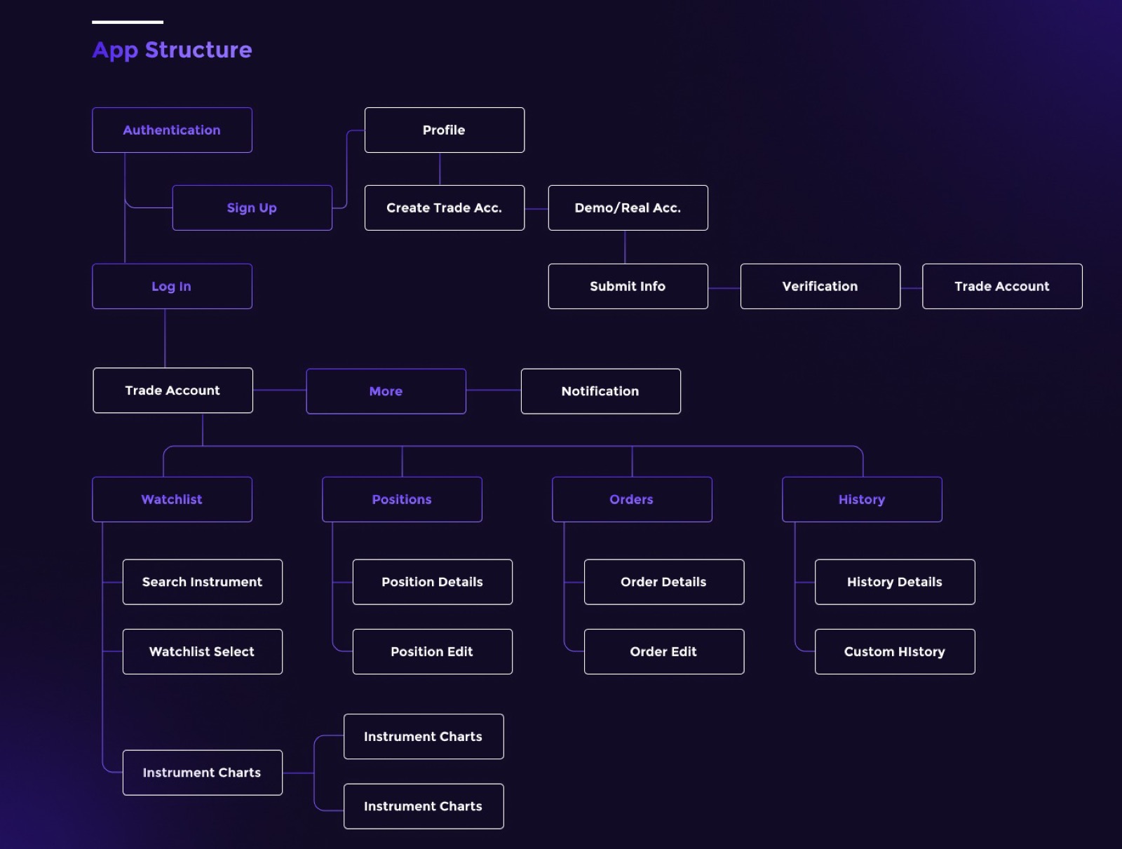 The NXFX information architecture. Source: Behance
The information architecture has two halves. The first gets a user from sign-up to a verified trading account. The second is the trading hub, built around four tabs that match how traders think: Watchlist (what am I tracking), Positions (what do I hold), Orders (what is pending) and History (what happened).
Opening a trade account
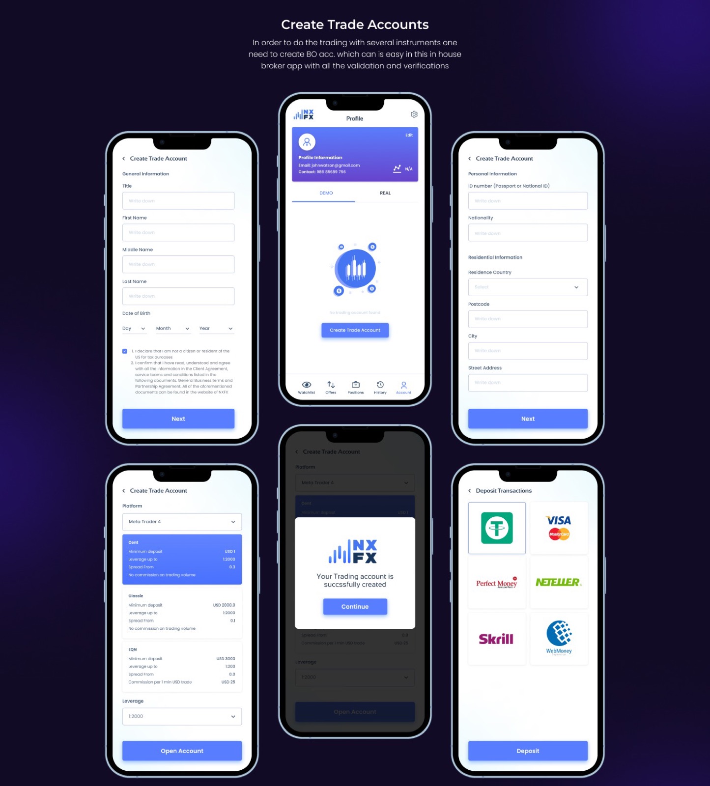 Account creation, from identity details to first deposit. Source: Behance
I designed NXFX as an in-house broker app, so account opening lives inside it. Identity checks come in short steps: general details, then ID and address. The user picks a platform (MetaTrader 4 in the mock), compares account types side by side by minimum deposit, leverage and spread, then funds the account. An empty state on the profile, “No trading account found”, points straight to this flow.
Charts and orders on one screen
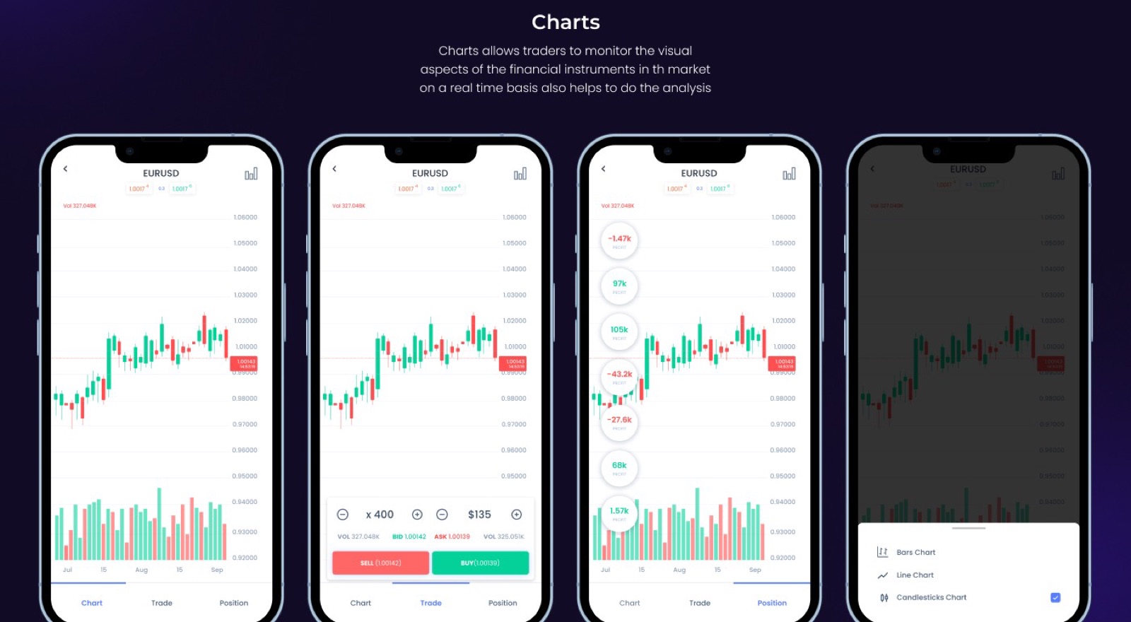 Chart, Trade and Position share one screen. Source: Behance
The key decision was to keep the chart in view while trading. Chart, Trade and Position are tabs on the same instrument screen, so a user never loses the price while sizing an order. Sell is red, buy is green, and both show the live price on the button. Users can switch between candlestick, bar and line charts. Orders, take profit and stop loss sit one tap away.
Demo and real accounts
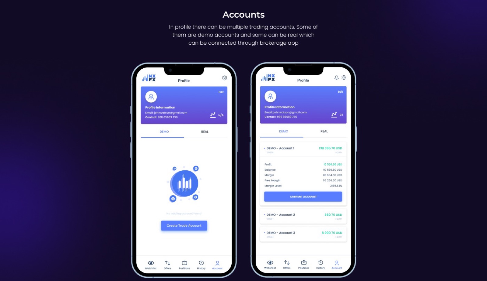 Demo and real accounts under one profile. Source: Behance
One profile can hold several demo and real accounts. Demo accounts are the novice’s safe place to practise. Each card shows balance, margin, free margin and margin level, and the user picks which account is current.
What I’d do differently
- Talk to traders first. The personas came from desk research. Five conversations with real traders would have tested them.
- Design for regulation. My mock shows leverage up to 1:2000. In the EU, ESMA’s 2018 rules cap retail leverage on major currency pairs at 30:1. A real product starts from the target market’s rules, and that shapes the whole account flow.
- Show the promised features. The brief lists news, signals and alerts. I designed the trading core but did not show those screens. A tighter scope would have been more honest.
- Make risk visible. Margin level is on the account card, but there is no margin warning in the trading flow. That is where a novice needs it most.
NXFX taught me to learn a domain before designing for it, and to treat regulation as a product input, not a legal footnote.
See the full case study on Behance and the groundwork in the Forex Trading: Analysis Study.